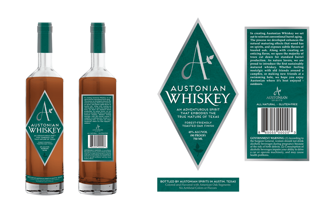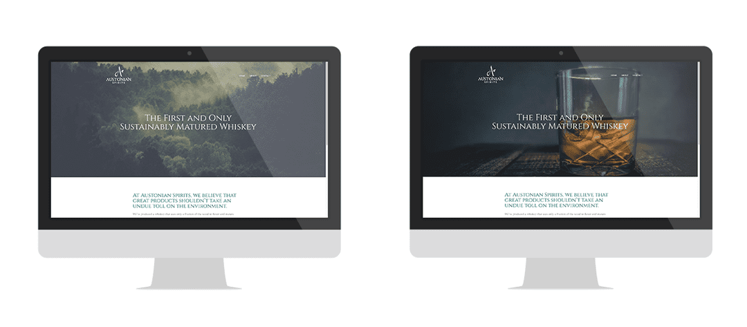
Logo, label designs, brand guidelines, and website for Austonian Spirits. 2016-2019.
Austonian Spirits was born from the idea that you can create a good, quality whiskey without the traditional burden on oak forests for barrels. They developed a process that matures whiskey sustainably, and only uses a tiny fraction of the wood normally used. Their founder came to me to help craft a brand identity that matched this idea of eco-friendly quality.
I developed a logo, brand guidelines (not pictured), label set for their first whiskey, label set for their second whiskey, and an initial launch website. The symbol in the logo was hand-drawn and then digitized. Using green as the primary color for the labels helps the bottle not only stand out on shelves (where whiskeys are dominated by earth tones and black), but speaks to the sustainable nature of the whiskey. The earthy, atmospheric photos used on the website further capture the feeling we were going for.
Their first product, Austonian Whiskey, is being distributed by RNDC and hit shelves in early summer 2017. Their second product, a Texas bourbon whiskey, hits shelves summer 2019. Visit their site for locations where you can find bottles.


